Blog Archive

Sunday, 25 March 2012

7 | Evaluation

Looking back at your preliminary task, what do you feel you have learnt in the progression from it to the full product?


During the planning of my preliminary in comparison to my actual magazine, I hadn't planned nearly as much. For example, when planning my preliminary I hadn't considered, that I'd have to plan the layout and layering, alongside the more obvious things such as the colour scheme, and font. I also hadn't thought of specific Time schedules to keep my work organised, and within certain amounts of time to ensure I didn't spend too long on certain things. When creating my preliminary magazine I also did not use the efficient programmes I should have for example, I did not use Photoshop to create my magazine, this was not ideal as it essentially meant I did not create a professional looking product. When creating my real magazine I realised that time management was a key aspect, which I learnt through my mistakes made when making my preliminary. I also used more efficient programmes for example, I used Photoshop to create my magazine. This allowed me to strengthen my skills in Photoshop creating two-three drafts of my magazine, experimenting with different techniques to decide what is the most successful.

I also considered in more detail the conventionalism of my magazine front cover, which was developed during the drafts of my magazine. For example, my preliminary magazine was missing the most vital aspects, such as, the barcode. I have also used a range of fonts. My masthead is central and stands out on the page, unlike my preliminary, and underneath conventionally there is a motto, that clearly highlights the unique selling point of my magazine. I have included a strapline at the bottom of the page as well as a clearly matching colour scheme. I have also added some more modern aspects such as the QR code, and the facebook and twitter visual links.
Most importantly, from my preliminary I learnt that it is important that I always during the creation of the magazine constantly refer to my research and planning to ensure that my final magazine was a reflection on my efforts made, and definitely a product that appealed to my target audience.

6 | Evaluation

What have you learnt about technologies from the process of constructing this product?

During the process of researching, designing and creating my
magazine I have used a range of new technological
programmes to help me. The main programme/website
I have used is blogger as, it has been an ideal
way show my work clearly while mixing
a range of media together for example, I was able to give links to
other sites, and upload pictures. I have particularly about the
embedding of coding, and how it contributes to the presentation
of my blog, e.g by embedding the links to my survey making it
appear in a box on my blog to be used.
I have also used blogger to ensure that all my work has been
uploaded on time, and to keep a clear record of that.


I have accessed blogger using my laptop, as well as the school
computers. I have also accessed other forms of technological
programmed using my laptop, which has been ideal when creating my
magazine as it allowed me to save the process' of my creation and go
back to it, and was able to develop the creation of each singular thing.
By using such a laptop I was also able to easily transfer images and
other programmes, that I could use.


I have constantly used my camera during the process of not only making the magazine but also, to take pictures of the work I have done on paper. Firstly, this technology has taught me that the quality of an image during the creative process greatly contributes to the overall quality of the magazine. The technology alongside the laptop also works well in terms of convenience- I was easily able to upload the images.

When researching and making more interesting versions of presentations I was drawn to using Prezi. Prior to making my magazine I hadn't used Prezi in the past. Using this new technology I not only learnt how to operate my way around the technology, but also how it can be used to combine with other media such as images, or even
videos from youtube. I also learnt how to make more interesting modern presentations, and ways of showing my research. I also later learnt how put these on my blog readily available rather than simply a hyperlink to the prezi. I have frequently used youtube during my research stage to look into other Alternative-Rock artists.

I have used a range of Microsoft programmes such as Word, Publisher, and Powerpoint, to create cleaner presentations and clearer writing. I have learnt that in the opening stages of creating a magazine Publisher is ideal for creating simple, clear plans for layout or initial drafts of the magazine. This is because it is easy to use and ideal for presentation as you are easily able to copy and paste and rotate them and freely lay them out on the page. I also learnt during the creative process that this isn't ideal for a professional looking magazine although, it is good for the initial structure. I also used Powerpoint to create a reasonable looking presentation for my spider diagrams etc. as it was neat and easy to use. Similarly I used word to write the articles for my magazine, this is because it is a more professional word programme and specifically can correct spelling and grammar. It also allows me to save my article in process, and later develop the text.


When choosing fonts for my magazine I used a website of which I hadnt used in the past, as well as a font used on word for the content of my articles. For my Masthead, and, coverlines I have used fonts from 'Dafont.com'. This meant I was able to look at a wider range of fonts when considering the fonts I will use. It also allowed me to consider whether my fonts suited the purpose in comparision to other fonts, also, it meant I was able to look for matching fonts.


Throughout creating my magazine I specifically relied on Photoshop when creating my front cover, contents page and double page spread. When creating magazine I first learnt how to crop an image using the lasso tool on Photoshop, I was able to crop around the artist allowing my front cover and double page spread to have a plain background. I also learnt how to adjust the lighting suitably. Although my skills with Photoshop were suitably comfortable I hadn't in the past been able to airbrush images, however, I learnt how to do this when creating my front cover, this also meant I learnt the significant difference between an un-airbrushed and how it contributes to the professionalism of the image. When adding the font I was able to experiment with different sizes of fonts, also how when resizing the fonts you must be carefull of maintaining the clarity of the image, ensuring the writing is clear. I also found that Photoshop was ideal for layering, this is because you can move the layers to make certain things overlapp on the page, which is ideal for a magazine, and again, makes the magazine look more professional.
This is a screenshot of me working on Photoshop. In this screenshot I was using Photoshop to create a more professionally edited image, by using airbrush. This was an effect I hadn't used in the past. However, by using Photoshop I was able to create an overall more professional looking magazine. 

5 | Evaluation

How did you attract/address your audience?
During my research stage I sent out a survey specifically to my target audience to research into the style of magazine the preferred etc. in order to attract them to my magazine:
Create your free online surveys with SurveyMonkey, the world's leading questionnaire tool.

Q1. What Gender are you?
I asked this question in order to know what kind of articles I would include, as well as, colours and organisation. Different genders tend to prefer different designs of magazines. As well as that, it specifically helped me decide whether my featured artist will be male or female. I found out that my target audience ere mostly female hence, I chose, for my artist to be female to attract the audience. I also chose to have certain articles also seen in woman's magazines such as horoscopes.
Q2. What Category Below Includes your age?
The most popular response was '16-18'. This again affects the content of my magazine, and what my articles will be about. For example I have included an article 'Really? Why do you guys like youtube?' this obviously directly addresses my target audience, focusing on them and their interests as young up-to-date teens. The age of my audience, also allows me to choose an artist of the same age, making them feel more personally involved with the artist.
Q3. Which style of Magazine do you prefer?
The most popular response to this question was 'informal and modern'. This essentially moulded the style of my magazine. Based on this question and response from my target audience, I designed the style of my magazine to be more modern, and informal, this involves, the name of the magazine, the font, the layout etc. It also, allowed me to think about not only the articles I would feature but the style of article I would use, and whether it be more formal or informal.
Q4. What colour scheme do you find most attractive?
I asked this question to not only gain some knowledge about my target audience, but also to simply chose a colour scheme first hand, that, ideally they prefer and would be attracted to. The most popular answer was: 'Navy Blues, Light Blues, Lighter shades of Grey and Red'. From this information, I actually chose to use the same colour scheme, but chose to add 'Black' as I thought it suited the colour scheme, and contrasted with Red. I also based on this colour scheme, chose to use an image with the same colours on my contents page.
Q5. What leads you to buy a music magazine?
I asked this question and formulated the response into a wordle. I did this in order to focus on the content of the magazine my target audience are interested in. One of the biggest words on my wordle were 'events' 'information' and 'music' hence, I chose to write two suitible articles: 'Best new up and coming artists of 2012', 'Okay, Seriously, where to be this year?' and 'I'm a fan so you must be? Right?'. This shows how I have considered what types of articles my target audience prefer and how I have directly targeted them through the content of my magazine.
Q6. Are you more attracted to a magazine that in unconventional?
I chose to ask this question as it is depended upon for the design of my magazine. It affected particularly the font, the colour scheme, even, the name of my magazine. The response being: 'yes, to some extent'. This meant when creating the magazine I focused on adapting the typical conventions of a magazine in order to attract the target audience, clearly considering their response in the creation of my magazine.
Q7. Do you find yourself more attracted to up-and-coming artists?
I chose this question in order to focus on the audiences needs in a magazine, and clearly what kind of artist they are interested in. I considered this when choosing the artist that I will feature in my magazine, also, what my articles will be about. The answer being 'yes' therefore, I chose have a featured up-and-coming artist 'Lana Milliyan', as well as an article focusing on the up and coming artists 'Best new up and coming artist of 2012'.
Q8. When featured on the front of a magazine do you prefer to see the whole band or just the lead artist?
I asked this question as I was considering whether to have a band or one artist on the front of my magazine. Instead of going with the more popular response which was 'The Band' I chose, to just feature the artist. I chose to go against what the audience had said in this instance in order to focus on the conventionalism of the magazine.

         -I have also written other articles to attract my target audience such as 'Your song' which attracts my more adventurous audience, as well as, 'Live, Love, Regret and tell us all about it'. I have also chose an artist that directly suits the Indie audience. I also after my first draft of my magazine received feedback which I took into great consideration when redrafting my magazine.


Create your free online surveys with SurveyMonkey, the world's leading questionnaire tool.

4 | Evaluation

Who would be the audience for your media product?

To begin my research stage I researched into my target audience:


My target audience are young teenage-adult females in the demographic of adventurers I based this on the fact at the planning stage of my magazine, I researched into my primary target audience: Fans of Alternative-Rock. I did this through as survey I did anonymously through the Internet. The first question I asked was 'What gender are you?' Of which my results showed that two thirds of my audience were female, this allowed me to clearly confirm that predominantly my target audience would be female. I then asked the age of my target audience and the most popular response was '16-18'. This allowed me to clearly know the age of my target audience. I also asked my target audience which colour scheme they preferred with a range of options such as 'pastel colours' to 'flourecent colours' however, my most popular response was a nautical/patriotic colour scheme, this allowed me to make some initial ideas about my target audience. I then asked them what leads them to buy a magazine the most popular response was 'event's' again, this allowed me to connote a significant amount about my target audience. I then asked what type of magazine they preferred formal or informal in which they said they preferred informal. I also asked my target audience whether they were more attracted to up-and-coming artists, of which the response was predominantly yes.  Based on the theory of Katz and Blulmer I can say that my audience would read my magazine firstly for a form of surveillance, I know this as they turn to my magazine for information, again this leads me to believe that I should include different interesting forms of information to lead them to my magazine, also Personal relationship and identity. Hence, the representation of my artist, the colour scheme, the articles and font must create an overall brand identity suitable for my magazine to draw them into my magazine.
Based on the information I received from my research survey I was able to create a primary audience concept:
- Predominantly Female
       I know this from my survey responses.
- Ages 14-20
       I know this from my survey responses.
- Interested in Indie/Alternative-Rock music
       I know this from my survey responses.
- An Adventurous audience
       I know this based on the fact that through my survey my target audience collectively conveyed feelings that they were interested in events and concerts they were also interested in more unconventional aspects in comparison to other magazines revealing that they are a more adventurous audience.
- Presumably mostly in education/Unemployed
       Due to their age I can deduce they are more than likely still in education.
- A lively audience
       My audience said they were interested in events showing that they are obviously energetic and lively.
- Interested in the more vintage/retro style
       Based on the colour scheme which is a more retro colour scheme, I can deduce that they are interested in a more retro/vintage 1940's style, yet due to their age, they more than likely prefer a mire urban edge.
- Interested in a more informal style of magazine 
       I know this from my survey responses
- Interested in the magazine for Personal identity/relationships and Surveillance
       When asked what draws them to a magazine my target audience responded information, this clearly shows that they are interested in using the magazine for surveillance. Also, the fact they were interested in events shows they are interested in the magazine for personal identity, their choice of colour scheme and the fact they themselves have narrowed them self down to a fan of Alternative-Rock and done my survey shows they are involved with the magazine for a personal identity and relationship.

I concluded that my target demographic/phychographic are aspires and explorers, I also found that they would be students. I found this through outlining the target audience of my chosen music genre, and so targeted my magazine at that audience.

3 | Evaluation

What kind of Media Institution might distribute your media product and why?
Option One: Bauer Publishing House
Bauer began as just a small printing house, but has now grown into a worldwide publishing company, distributing all forms of media such as, magazine, radio and television with offices in up to 16 countries including China. Bauer distributes up to '282 magazines in 15 countries'. Bauer distributes the publishing brands: 'Bella', 'Take a break and That's life!' As well as the Media Brands: 'Q'magazine, and 'Kerrang!' and radio form: 'Bauer radio'. Bauer also has a '50% stake in the British television Company Box Television'. Bauer gained a revenue of '€1.79 Billion in 2006', with '6,400' working employees. However, what makes Bauer an ideal distributor for my magazine is the fact that it distributed a similar magazine to mine: 'Q' magazine. Gaining from it a profit of '89,450(m)'. This obvious success leads me to believe that Bauer although, not an independent company could be an idea distributor for my magazine. 'Q' Magazine is sold in any local newsagent (in the UK) and can be ordered at request, also, can be sold at some WHS Smith and any HMV. This is ideal, as I intend for my magazine to be as locally available as Q is, as well as more industrially available, similarly to 'Q'.
Again, making Bauer seem an ideal distributor, as although, it is a global conglomerate as shown by the example 'Q' respects the more independent qualities I wish to keep whilst globally distributing my product. Also as my product has been produced for a more niche audience, I intend to sell my product in more private book stores and selected stores. I also think my magazine has an ideal opportunity for synergy for example holding concerts and events to gain a larger revenue, as well as attracting a larger global audience similarly to 'Q':   "Q will chalk up a quarter century in 2011 and will do so by continuing to extend its reach amongst audiences online, on TV, on Radio and at live events." Said, Stuart Williams, MD of Bauer Media's and Film Portfolio.

Option Two: IPC
"IPC Media produces over 60 iconic media brands, with print alone reaching almost two thirds of UK women and 42% of UK men – almost 26 million UK adults – while their websites collectively reach over 20 million users every month." IPC was reported to have been largely affected by the 2009 with a loss in profits by 37%. This is particularly unappealing as it makes the distribution company seem unreliable.  IPC distribute the music magazine: 'NME' as well as 15 other magazines. 'NME' is most known for its website form, as it is the "Europe's most successful music website, with over 4 million unique users across the globe." This is appealing, as I would like my magazine also be in an Internet form. However, based on the other magazine IPC distributes and the older target audience, I do not fee that it is the best option for my magazine.
I think Option One: Bauer Publishing House would be the best distribution company for my product as it produces other similar Media products such as 'Q' magazine, based on their success under this Publishing Company, I believe my magazine will mimic such success. Also similarly to 'Q' magazine I would intend for my magazine to be available on order for local shop agents, so it is readily available for my niche audience.Although my magazine would be sold at some WHSmiths and HMV stores so it is easily available, I would also like my magazine to be sold in private, specially chosen in areas where areas where my target audience are situated such as soho, or covent garden. I also feel which such a global conglomerate as a distributor -Bauer Publishing House- there are ideal situations for synergy, such as music festivals, or even CD's featuring all up-and-coming artists that have been featured in my magazine, also a radio station in association with Bauer Radio.

Tuesday, 20 March 2012

2 | Evaluation

How does your media product represent a particular social group?

The target audience of my magazine are predominantly female, who are obviously fans of my chosen genre: Alternative-Rock/Indie. My magazine is targeted at a younger audience of around 14-20. An Indie fan tends to have a more unique dress sense: a mixture of both the vintage/retro style with an urban/modern edge. The indie style can also be relatively grungy, as well as, smart. I have focused during the creative process of my magazine not to negatively portray my particular social group, in order to make the magazine particularly more appealing to my target audience. My magazine will cost £2.50 which is relatively expensive however, the content, and style of magazine compensate for the price I feel, the price isn't unreasonable considering that the magazine will be distributed monthly.

Artist representation: 
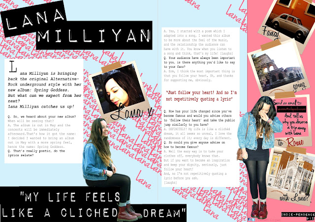
Firstly I chose a female artist as, the research from my questionnaire showed that the audience were predominantly female. Hence, I thought that my more female audience would feel a sense of familiarity in the fact the artist is female and they would be able to relate to her. As you can see I have used a close-up shot similarly to the other indie magazine present. This is to make the magazine look more personal, and the audience more involved. This is supported by the fact that the artist and the example magazine are giving a direct-address. Again, this makes the magazine more personal, as it makes the artist again, seem more personally involved. It also presents the artist as a strong confident character which is appealing to the audience as it inspires them. You can see the artist in the other magazine has been presented as playful yet adult, I have tried to capture the same portrayal by having my artist smiling. The artists expression is smiling, this makes the artist seem upbeat and happy. My artist, in contrast has only her face in shot, where the other magazine has the artists hands against her face. This makes the artist in Indie magazine look shy, whereas, by only the artists face in shot presents the artist as again confident.
I specifically chose for the artist to not look more, stereotypically seductive as, based on my target audience of teens; I felt it more important that the artist be presented as more confident and inspirational, creating a more positive aspiration for teenagers and young adults. I chose for the artist to be presented as less sexually proactive as it untypical, and would attract the younger audience. It is also more suitible for the audience representation, as it makes the social group targeted itself as less objectively sexual and more inspirational. My target audience is also predominently female hence, it seemed relavent for the artist to be presented as more an inspirational figure, rather than a sexual aspiration for a more male audience. This is supported by the fact the artist isn't wearing seductive clothing, or vibrant makeup.
Indie Fashion:
The conventions of a female Indie fan:
- Long messy/wavy hair
- Baggy over sized clothes
- Jean shirt or a patterned shirt
- Short shorts/skirts
- Show-jewelry
- Dr Martens or big 80's Rock-scene boots
- Minimal, and/or, dark make-up
- Patterned clothes

Clothes:

Indie clothes tend to be over sized and baggy, this is because the style has been altered from the original 80's style of over sized clothing. This presents the Indie genre, as creative and retro, it also plays on the conventions of the 80s style portraying an Indie-fan as also upbeat and careless. It also makes the artist in my magazine seem less as vain; as if she were wearing the baggy clothes for comfort rather than fashion, again strengthening the Indie look as more, careless, yet original and less as mainstream. The baggy clothes can also be called the 'boy-friend' style as they are meant to be supposedly so baggy that you are wearing your boy-friends clothes, this presents the social group as more wild, and confident. The Indie style also tend to wear a lot of Jean. Again, this could be portraying the artist as careless for fashion, as they may simply be wearing the jean for warmth.
It could also be to suit the retro style, with again, an urban edge, this portrays the artist and Indie scene as up-to-date and unique, and again, showing that they do not follow the mainstream. The messy look also makes the Artist and Indie-scene, seem more careless yet, wild and positively upbeat. It also again focus' on the more urban-look again, without being too mainstream, portraying the Indie fan as original and different.  The Indie style also focus' on a more upbeat style of bright colours and pattens and show jewelry. This brings a positive edge to the grungy 80s style. It also makes the signature Dr Marten boots for example, seem less as threatening or oppressive but makes them look more childish in some ways like a child wearing an adults shoes, portraying the Indie scene as more playful, supported by the over-sized cardigan.
Hair:
The Indie-style are known for their long, messy or wavy hair. The length of the hair, in some ways makes them seem childish like a child with long un-cut hair, it also, has obviously taken them some time to grow their hair to that length, however, it also makes them seem committed and/or patient. It could also make them seem more careless, and free, simply allowing their hair to grow naturally without styling it. This is supported by the fact the hair hasn't been forcibly straitened, or curled, it has just been naturally left. The fact that the hair also has the unbrushed look also makes the artist and Indie fans seem more grungy and careless, and again, wild. The hair also being left creates a more natural look, this is a positive portrayal of an Indie fan as it makes them seem again, more careless for the mainstream style but confident and comfortable in a more natural style.
Make up:
Similarly to the hair of an Indie fan the make-up tends to be minimal. This makes the Indie fans and artist seem more confident and again, more natural. However, it is also popular for the artist to wear thick eyeliner, this could simply be strengthening the more natural look or, could be adapting the more 1940's style make-up (thick eyeliner and natural pale shade of foundation), again drawing in on the retro style. It also makes the artist and Indie style more feminine as well as, creating a signature look. The make-up around the eyes also draws the attention to their eyes. It also stresses the fact that although the artist is wearing make up they do not intent to look seductive.

Wednesday, 14 March 2012

1 | Evaluation

 In what ways does your media product use, develop or challenge forms and conventions of real media products?